Saturday 21st September 2019, 2.00pm to
4.00pm
Peter Smales Seascape in Oils
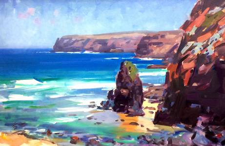
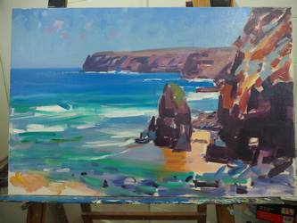
Pinnacle Rock - A stunning Seascape Demo
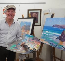
 We were delighted to have
Peter Smales demonstrate to a full house on Saturday 21st
September. Peter is a member of the prestigious ‘Twenty Melbourne
Painters’ and ‘The Victorian Artists Society.’ He
characteristically works in an impressionist style from a plein air
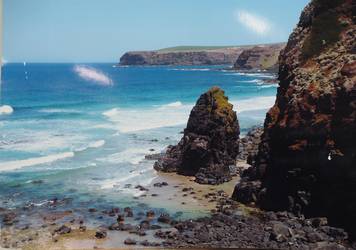
start. Because the light changes so quickly, he takes a photo on
site and finishes in the studio with the photo as a reference. He
points out that, “Making a painting isn’t just copying, it needs a
design with balance of light and dark to create harmony, and needs
to draw the eye around in a circular fashion.” Today’s subject came
from Mornington Peninsula on a clifftop walk around inaccessible
wild beaches leading to Cape Schank. It showed a wide bay with a
distant headland, and in the foreground a rocky cliff and
free-standing pinnacle rock with transparent waves running in over
sand and rocks around its base.
We were delighted to have
Peter Smales demonstrate to a full house on Saturday 21st
September. Peter is a member of the prestigious ‘Twenty Melbourne
Painters’ and ‘The Victorian Artists Society.’ He
characteristically works in an impressionist style from a plein air
start. Because the light changes so quickly, he takes a photo on
site and finishes in the studio with the photo as a reference. He
points out that, “Making a painting isn’t just copying, it needs a
design with balance of light and dark to create harmony, and needs
to draw the eye around in a circular fashion.” Today’s subject came
from Mornington Peninsula on a clifftop walk around inaccessible
wild beaches leading to Cape Schank. It showed a wide bay with a
distant headland, and in the foreground a rocky cliff and
free-standing pinnacle rock with transparent waves running in over
sand and rocks around its base.
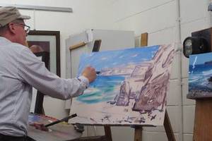 Peter came prepared with a large
board, prepped with a pale warm pink tone and the rocky cliffs already
outlined. He used a large palette made from MDF and shaped to sit on
his arm with two holes: one for a hand hold and one for working
brushes; and two small jars attached for medium. His palette was
prepped with the oils in a rainbow of six primary colours with a warm
and cool for each of yellow, blue, and red with white in the centre.
When asked why no black he explained that he mixes darks for instance
with windsor blue and cadmium red.
Peter came prepared with a large
board, prepped with a pale warm pink tone and the rocky cliffs already
outlined. He used a large palette made from MDF and shaped to sit on
his arm with two holes: one for a hand hold and one for working
brushes; and two small jars attached for medium. His palette was
prepped with the oils in a rainbow of six primary colours with a warm
and cool for each of yellow, blue, and red with white in the centre.
When asked why no black he explained that he mixes darks for instance
with windsor blue and cadmium red.
 He started today’s painting with
a broad flat brush and thin, turps-based pigments to see how the
relationships work, and started from the back plane to the front,
working down the canvas to cover the board with the first layer. Being
so thin, it dried quickly. Pointing out the range of tonal contrasts
he explained that this is what creates a 3D effect. Broadly consider
the range of light and dark with the foreground being strong tones,
the middle-distance mid tones and the furthest objects being the
lighter the tones. This tonal gradation is used to creates a sense of
distance. Up front needs dark tones and strong contrasts. At this
point of the painting he noted it was important not to take nature at
face value and to change the composition to bring the eye back around.
He started today’s painting with
a broad flat brush and thin, turps-based pigments to see how the
relationships work, and started from the back plane to the front,
working down the canvas to cover the board with the first layer. Being
so thin, it dried quickly. Pointing out the range of tonal contrasts
he explained that this is what creates a 3D effect. Broadly consider
the range of light and dark with the foreground being strong tones,
the middle-distance mid tones and the furthest objects being the
lighter the tones. This tonal gradation is used to creates a sense of
distance. Up front needs dark tones and strong contrasts. At this
point of the painting he noted it was important not to take nature at
face value and to change the composition to bring the eye back around.
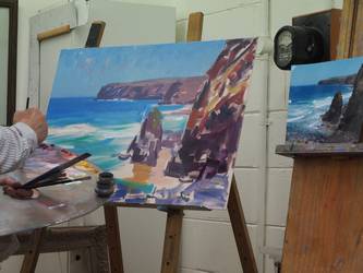
 With step two, the audience could see the painting start to come alive
as Peter committed to overlays with more solid paint. Again, we could
see the diminishing tones in the far headland, covered with
transparent glazes and a variety of colours but with consistency of
tone. The near rocks and cliffs took on drama with contrasts of light
and dark in confident strokes of browns greens and reds showing the
rocky cliff catching light on various surfaces. He warned against
getting lost in too much detail, keeping the brush strokes consistent,
cutting in around the shapes and adding that it is better to
understate.
With step two, the audience could see the painting start to come alive
as Peter committed to overlays with more solid paint. Again, we could
see the diminishing tones in the far headland, covered with
transparent glazes and a variety of colours but with consistency of
tone. The near rocks and cliffs took on drama with contrasts of light
and dark in confident strokes of browns greens and reds showing the
rocky cliff catching light on various surfaces. He warned against
getting lost in too much detail, keeping the brush strokes consistent,
cutting in around the shapes and adding that it is better to
understate.
Now we could see rich colours emerge. Several blues in the
sky and the sea with some pink being added, more blues and some
emerald for the near water and various yellows and gorgeous mauves
for the wet reflective sand. As he mixed these rich colours Peter
explained that to create a range of greens, it depended which blue was
chosen. For instance, the emerald was a mix of windsor blue and lemon
yellow, but a more purple green would be mixed from the purple style
end of the blue spectrum. To encourage the eye to travel around the
painting, small smudges were made in straight edges, such as the white
wave edges, to encourage a visual path way. When questions were raised
about how best to show the light, Peter elaborated on the need to
avoid using lots of thick white.
 He also insisted on avoiding “mud” by
keeping colours separate and only blending a little at the edges. He
also explained that better effects are achieved by contrast, with the
eye going to the areas of greatest contrast.
He also insisted on avoiding “mud” by
keeping colours separate and only blending a little at the edges. He
also explained that better effects are achieved by contrast, with the
eye going to the areas of greatest contrast.
With time up he felt there was only some minor tweaking left. It’s no easy task to simultaneously chat, tell anecdotes and explain the process of tonal relationships to keep an audience engaged while gradually building a landscape in oils, and Peter managed all this till close at 4 pm when he threw an ornate frame over the work and the audience burst into spontaneous applause!
Report by Jane Taylor
Copyright
© 2019
Whitehorse Arts Association
All rights reserved.